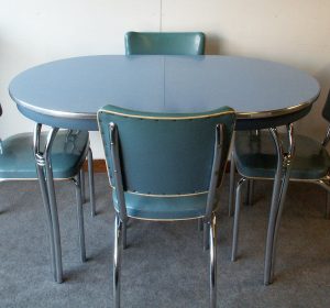
The 1955 Good Housekeeping Magazine that I thrifted recently keeps on giving me new insights and information about the mid-century. One case in point was a multi-page article about creating the dream kitchen. In the photos you see gleaming white appliances and colour coordinated pastel cupboards, backsplashes, countertops, table and chairs. Not much natural wood can be found. In fact, they thought there was too much of a contrast between the white appliances and the dark wood and that vibrant pastel colours were a better environment for the housewife to work in. A kitchen should be bright and cheerful and easy to clean. It should also be designed to make the housewife’s work more efficient. Bear in mind that many of the appliances were relatively new and quite expensive, so the magazine’s kitchen plans were often more aspirational than practical for the average family. Much like today really.
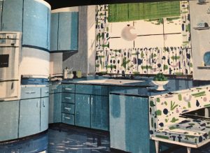
This blue kitchen was very popular as a colour theme. In this design the cupboards are metal and have painted doors and often the doors cover the front of the appliances to give a streamlined look. Everything was tied together with darker or lighter, greener or redder shades of blue. Also popular was yellow, green or pink for kitchens. To our eyes it seems too matchy-matchy and we would likely paint the bottom cupboards a different colour to break up the wall of turquoise blue. You can see the matching curtains and breakfast nook upholstery. They are likely to be made of one of the new miracle fabrics, think plastic. Plastics or vinyls were pretty cheap and easy to clean. Coming into a world where most things were made of cotton or wool, new fabrics like nylon, orlon or other plastic were really easy to take care of and were hardwearing. Formica and Linoleum were equally praised for being easy care, easy to clean and cheerfully coloured. The linoleum was colour matched to the cupboards too, usually a deeper shade. If there was a backsplash it would likely be been made from the new and exciting plastic tile, advertised as hardy and sanitary. It was not unusual to see plastic scrubbable wallpaper to match the curtains and upholstery. Imagine the plasticky smell coming out of a brand new kitchen!
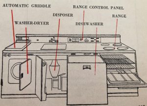
Something that seems odd now, is the idea of a pre-fabricated bank of appliances such as the design above. Wired into a single unit, it was a better deal than buying each appliance separately. Something that was suggested as a wonderful asset in cooking although not in this entry level unit, was the double oven range. That is two small ovens under a cook top. In the time before microwaves having lots of oven space would be more necessary. And of course the unit came in a variety of pastel colours. You will note a couple of odd things, by today’s standards anyway. The washing machine was a washer-dryer combo. They still exist but generally are thought to be less effective than a separate pair. The automatic griddle seems a bit unnecessary and not something that I would use often. I would like the space above the laundry machine for folding clothes. The dishwasher was truly a luxury then. Quite a high end bank of appliances, again very aspirational rather than practical for everyone’s budget.
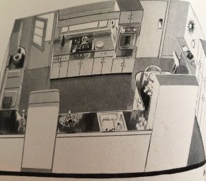
This bird’s eye view of an ideal kitchen shows off all the things a housewife was thought to need. There is lots of storage space too. You can see there are all the usual appliances including a washer and dryer. I think having them in the kitchen would be handy. There may be a small freezer hiding behind one of the cupboard door. A freezer was a real luxury and something most households couldn’t afford. There is not a lot of counter top space compared to most modern kitchens but there was often a pull out or pull up section of countertop for baking and food prep. There was often a small kitchen table or breakfast nook in the kitchen for less formal meals and this was an extra space to roll out cookie dough or prep veggies. There is also a small desk area for meal planning and paying the bills. It is not the clearest of diagrams but gives you an ideas of what the designers thought housewives needed to run the home. This was the beginning of planning a kitchen to save steps and be efficient.
I had a great aunt whose house was built mid-century, in the early 1950’s. The kitchen had bright blue tiles up all the walls and bright blue linoleum on the floor. The countertops, table and chairs were matching blue formica. The cupboards were white and the trim was black. All the appliances were bright white. It had custom made cupboards and shelves using every inch of space and even a hidden ironing board. And the bathroom right next door was a repeat except in pink with fixtures in pink too. These matching touches were cheerful but for day to day living it was kind of intense in a relatively small room. Many things change over time but the focus on making a kitchen design workable for the housewife and family friendly still persists and kitchen is still the heart of the home.
